"MAKE A CONFIDENT MISTAKE NOT A TIMID ATTEMPT"

Thursday, 10 November 2016

Brand new brushes

Just a quick tip here :

When you buy a brand new brush (and oh isn't that great) remember to put it in some clear water for 2 or 3 minutes first...let it sit and soak up the water.   Brand new brushes have a coating on them, it holds them together before use, so you need to release that first.

You will see when the brush has relaxed and soaked up some water, you will then be able to use it with your paints.

~~~~~~~~~~~~~~


Sunday, 18 September 2016

It's all a matter of Observation

Easily said - easily forgotten

That certainly goes for painting.
As Artists we tend to observe the world slightly differently from others,
but we don't always remember to Look

Looking AROUND US at the every day 
what do we actually miss!

....example was our sun brolly in the garden....

"Was it really LOOKING at ME"!

 Easily missed, but made me THINK.


Friday, 2 September 2016

Applying Masking Tape

The usual recommendation for adding masking tape to paper, is place it on your clothes first...it takes off the excess stickiness and allows you to remove the tape from the paper without tearing it.


Although a problem with that method is, you can often lift the pile from the clothes onto the tape...not so good.

I find it better to run your hands over the masking tape, that takes off the excess stickiness very effectively and the tape still comes off the paper easily.


~ job done ~


Friday, 12 August 2016

Never mix paint with your best brush

If you have special brushes - i.e. kolinsky sables or even mixed synthetics with very good points

see pics...


You really will not want to be ruining those beautiful pointy tips.  I can assure you, if you start mixing paint with them, those tips will be no more!    Always mix your paint with a lesser brush, sometimes I use a very cheap oil bristle brush or similar, for mixing paint.  That way it doesn't matter if the brush gets ruined.


Thursday, 21 July 2016

Showing Light

 When you want to emphasise a Light area, you have to put a contrasting Dark area next to it.   Obviously this works in reverse too.

This sketch shows how that works....


Saturday, 16 July 2016

Let the paint do the work

This example sketch of a tree trunk shows how simple this technique is.  

1.  The ink outline forms the shape  

2.  I wetted the trunk with clear water

3.  Then dropped in random (and I truly mean random) colours on the right hand side of the drawing

Yellow Ochre - Burnt Sienna - *Sap Green - Burnt Umber

*the Sap Green was the only one that I purposely put to the left...don't overdo even though it is tempting!

THEN when the colours are in, I 'carefully persuaded' the paint to drift to the left, but not too much.  It's good to leave some gaps of paper showing.

Leave it to completely dry.  The magic happened all by itself...in fact the painting PAINTED ITSELF.


Go on, give it a try.


Saturday, 2 July 2016

TONAL VALUES

Having trouble finding the Lights in a scene?

Example this photo for instance:


THEN  LITERALLY  SQUINT

AND THE LIGHT AREA WILL JUMP OUT AT YOU.

Happens to be 3 areas in the above photo:

1. the sky
                             2. the reflected light under the bridge
                       3. the strip of grass that runs across the scene
 

plus by Squinting

the DARKS will be very obvious too.


SO REMEMBER TO SQUINT AT A SCENE
IT WILL HELP YOU SO MUCH WITH TONAL VALUES 


~ ~ ~ ~ ~ ~ ~ ~ ~ ~ ~ ~ ~


Thursday, 30 June 2016

Working slower

LOOSE painting does not mean QUICK painting.  Some think they need to work a piece of art in a quick way in order for it to become a Loose artwork, but NO ....TAKE YOUR TIME and your art will look all the better for it.


Monday, 20 June 2016

Using Black

Well, for a start DON'T use Black straight from the tube.  Black will totally finish off your painting.  Straight from the tube it has no depth, the light doesn't bounce back off it - basically it just falls FLAT/DULL/WITH NO IMPACT......

This is where you need to MIX YOUR OWN BLACK


I hope this will show up from the photo on my camera...

This is 
Black from the tube


Here's a mixed Black  

So from now on always mix your Black


Another alternative to Black is

Alizarin Crimson + Hookers Green
Another perfectly acceptable Black


TEST THIS OUT FOR YOURSELVES,
YOU WILL SEE WHAT I MEAN.


Saturday, 18 June 2016

Allowing Light spaces in your paintings and sketches


The First version of this riverside scene was painted in one go, 
from top to bottom

However, it has NO LIGHT SPACES OF PAPER


This Second version was painted a section at a time,
allowing some areas to dry first
and HAS LIGHT SPACES OF PAPER


Very often Beginners will paint like the First version
whereas
the Second version is something they will eventually get to with more experience.

~


Saturday, 4 June 2016

How much Detail to add

A fellow blogger mentioned to me that she tends to put a lot of detail into a painting where it isn't needed.  That gave me this blog post, as I know exactly what she means and thought I would give you my spin on how I deal with this issue.

Firstly, and most important before getting into the details of a scene, is where you begin with a painting - having the FOCAL POINT.  The place that the eye goes to when you first look at a scene.   But, how do you know what that is.

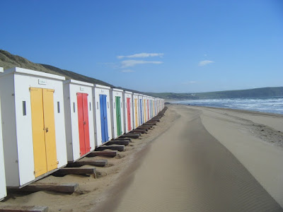
Say for example you are looking at this beach scene, either in person or using a photo:


I'm reckoning that you looked at the First two beach hunts on the left,
then your eye travelled to the distance, across the water and back to the foreground.


Then comes the matter that my blogger friend mentioned saying she tends to Add too much detail.  We are all guilty of this, but try to KEEP IT SIMPLE.      SEND THE EYE AROUND THE SCENE (as with the above photo).  

Example 1
   A quick example of the photo reference,
but I'm sure you get my point.

This is a very Basic scene - you could add some people:

 Example 2
You see I have also added some birds plus two people.

 HOWEVER
If I added more.....

Example 3
 WAY TOO BUSY

The Boat is too distracting 
The large seagull too distracting
The person with the dog too distracting

SO
KEEP 
IT
SIMPLE


 ~ Happy Painting everyone ~


Wednesday, 11 May 2016

Painting Trees

There are various methods, but for today I thought I would share this version -

Simply by using scrunched up kitchen towel,
so it couldn't be easier.

But first, 

prepare your paint 
and have plenty ready


Then dip the kitchen towel into the paint


and dab onto your paper


In my version I painted the trunk first
then added some lines for branches later


To recap:
Plenty of Paint  >  Dip scrunched up kitchen towel into the paint  >
  Dab onto paper  >  Paint the trunk and branches before or after (it's entirely up to you).


Monday, 25 April 2016

Circles and your pathway to a drawing

You hear art professionals teaching their drawing techniques.  Their knowledge and experience is very important to us all, whether we are beginners or experienced artists brushing up on some basic skills.  I do have to say that, for beginners in particular, the technique of drawing circles can seem daunting.  It is easy to see the principle of the exercise, but actually it can fill the beginner with a lack of confidence.  All those circles take over in the eye of the beginner, looking nothing like the subject they are trying to draw, and hence they tend to give up.

Here I'm using a photograph of our lurcher, William (many of you will be familiar with this lad, since I draw him almost every day).  


 Step 1:  Draw the basic 'shapes' first.  Ignore detail.....


Step 2: 
Having referred back to the photo, I saw that the head needed to move toward the viewer.  I also added the football in his mouth.....

Step 3: Now is the point at which I put in some detail.
Note that the initial circles are still there, but I'm 'correcting' some angles.....


Step 4: With that done I can erase the unnecessary circles -
and I have my drawing.....


and Step 5: Add some watercolour -
plus in this case some 'action' lines to indicate movement.....

A simple enough exercise.
Recap: From all those circles, you will find the pathway to your final drawing.


Wednesday, 30 March 2016

Drawing Rocks in watercolour

Basically very easy to do...

I used three colours for these rocks

YELLOW OCHRE

BURNT UMBER

ULTRAMARINE BLUE


I thought it would be easier to do a video to show you this:


the completed painting:


Wednesday, 9 March 2016

Deciding on the scene

Sometimes there is so much going on with a scene, that it is difficult to know where to start, let alone how to go about painting it.

My advice.  RESTRICT THE SCENE TO SOMETHING SIMPLE.  Look for the INTERESTING feature in a scene and draw that.  You can always add to it in another drawing.  Plus,  make a few 'Ideas' sketches, to get the feel for the drawing and the scene you want to paint.

Here's what I mean:

(courtesy Google Street View) 

Where to begin - so I moved along the road a bit and happened upon this:


 (courtesy Google Street View)
 
It was tempting to draw the seated statues to the right, but then I thought the doorway looked lovely - an interesting shaped porch, shadows cast across it - Yes, this is the scene for me....


 Still a sketch of the original scene, but simplified.


Saturday, 27 February 2016

Sending the viewer into the painting

Quite simply it is like looking at perspective buildings...because they get smaller into the distance, the eye is drawn down a road.  

In the same way, if you are painting a sloping hill, you need to have your paint going in that direction.

Here, I've done a quick sketch of a beach scene....see how the lines of the sand go towards the sea.  It pulls the eye in that direction...


Sunday, 21 February 2016

Let random splodges work for you

IT DOESN'T HAVE TO BE THROWN AWAY...Hold onto those paint splodges and random pieces that normally would hit the bin....

I happened to put my brush on some kitchen paper - it absorbed the paint from the brush!  When dry, it looked like a blue flower, so I used it and just added a few squiggles of pen.


ONE BLUE FLOWER

I CALL IT

'OUT OF THE BLUE'


Wednesday, 10 February 2016

So what is this?


Of course.....a chicken.   Yet only drawn with 'Shapes'.   Just goes to show how a few simple lines can portray the subject.


Friday, 5 February 2016

Paint with Confidence

"MAKE A CONFIDENT MISTAKE

NOT A TIMID ATTEMPT"


Even if a brushstroke is WRONG....if it is painted with a confident stroke

it will look like it is MEANT TO BE.

Go on, try it and see.


Saturday, 16 January 2016

Sketching - bring a sketch together

Days out give me the chance to do lots of sketching.  At this time of year that often means sitting in the car, but I'm not complaining.  Sat with my sketchbook, pens, paints and a cup of coffee to drink is my idea of bliss.

Here I've done a quick sketch whilst we stopped at a retail park (yes more shopping).


There's a bit of a lesson in this sketch.  The various areas > hills > houses > cars are tending to all be Separate  -  whereas the overall drawing would look better if the areas merged a bit.  So I addressed this issue by adding watercolour to the evergreen tree - it know brings together the hills in the background plus the car below it.  I felt this was enough, sometimes overworking can spoil a piece...it's good to have spaces too.

It only needed a little subtle change to bring the drawing together.


Friday, 15 January 2016

When paint bursts into blooms and cauliflowers

Call them what you will...Watercolour paint will spread and do it's own thing if you are not careful.
Some call them 'blooms' others refer to them as 'cauliflowers'.

Okay, I've already done a blog post on this, but since it is a recurring issue with artists, especially those first learning, I felt it was worth another post here.

In this example painting of a Lighthouse, you'll notice that there is a darker area representing a window on the body of the building.  I did this Whilst the other paint was WET, and yet it didn't spread > bloom > cauliflower. 

This was possible because when I added the window, I used a thicker consistency of paint, thus the weight  of the paint being added was heavier than the paint it was going into, and hence it didn't spread.  


~ I hope this blog post is of help ~