"MAKE A CONFIDENT MISTAKE NOT A TIMID ATTEMPT"
Thursday, 30 June 2016
Working slower
LOOSE painting does not mean QUICK painting. Some think they need to work a piece of art in a quick way in order for it to become a Loose artwork, but NO ....TAKE YOUR TIME and your art will look all the better for it.
Monday, 20 June 2016
Using Black
Well, for a start DON'T use Black straight from the tube. Black will totally finish off your painting. Straight from the tube it has no depth, the light doesn't bounce back off it - basically it just falls FLAT/DULL/WITH NO IMPACT......
This is where you need to MIX YOUR OWN BLACK
I hope this will show up from the photo on my camera...
This is
Black from the tube
So from now on always mix your Black
Another alternative to Black is
Alizarin Crimson + Hookers Green
TEST THIS OUT FOR YOURSELVES,
YOU WILL SEE WHAT I MEAN.
Saturday, 18 June 2016
Allowing Light spaces in your paintings and sketches
The First version of this riverside scene was painted in one go,
from top to bottom
However, it has NO LIGHT SPACES OF PAPER
This Second version was painted a section at a time,
allowing some areas to dry first
and HAS LIGHT SPACES OF PAPER
Very often Beginners will paint like the First version
whereas
the Second version is something they will eventually get to with more experience.
~
Saturday, 4 June 2016
How much Detail to add
A fellow blogger mentioned to me that she tends to put a lot of detail into a painting where it isn't needed. That gave me this blog post, as I know exactly what she means and thought I would give you my spin on how I deal with this issue.
Firstly, and most important before getting into the details of a scene, is where you begin with a painting - having the FOCAL POINT. The place that the eye goes to when you first look at a scene. But, how do you know what that is.
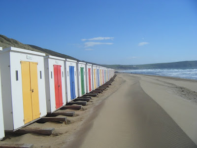
Say for example you are looking at this beach scene, either in person or using a photo:

Then comes the matter that my blogger friend mentioned saying she tends to Add too much detail. We are all guilty of this, but try to KEEP IT SIMPLE. SEND THE EYE AROUND THE SCENE (as with the above photo).
Firstly, and most important before getting into the details of a scene, is where you begin with a painting - having the FOCAL POINT. The place that the eye goes to when you first look at a scene. But, how do you know what that is.
Say for example you are looking at this beach scene, either in person or using a photo:

I'm reckoning that you looked at the First two beach hunts on the left,
then your eye travelled to the distance, across the water and back to the foreground.
Then comes the matter that my blogger friend mentioned saying she tends to Add too much detail. We are all guilty of this, but try to KEEP IT SIMPLE. SEND THE EYE AROUND THE SCENE (as with the above photo).
Example 1
A quick example of the photo reference,
but I'm sure you get my point.
This is a very Basic scene - you could add some people:
Example 2
You see I have also added some birds plus two people.
HOWEVER
If I added more.....
Example 3
WAY TOO BUSY
The Boat is too distracting
The large seagull too distracting
The person with the dog too distracting
SO
KEEP
IT
SIMPLE
~ Happy Painting everyone ~
Subscribe to:
Comments (Atom)


