"MAKE A CONFIDENT MISTAKE NOT A TIMID ATTEMPT"

Saturday 26 August 2023

Winsor and Newton

Here’s an example of the Winsor and Newton paints I tend to favour.  Okay, this painting isn’t finished in the image here, but you can no doubt see how good they are.  The paint moves well over canvas or panel and colours retain their quality. And Quality they are.


Tuesday 20 June 2023

It’s been a while!

I tend to leave blogs for some time, clearly, as it has been a while since I added a post here -  And that’s a lesson in itself…..Motto…”Keep posting, even if the posts are small, but keep adding regularly”.

OILS

Really enjoy oils, so this will be my next “Tips”

There are lots of different Brands within the Oil paint world.  My go-to are Winsor and Newton, the Winton ones and they are the Student grade.  Some people think these won’t be so good, but the pigments are superb. (So much for peoples preconceived ideas).

My next post will be more about this particular brand.

See you soon…..


Monday 8 March 2021

Gesso

 It may not look much, but this is an Art Board re-primed.

The piece I was working on really didn't come together, so I decided to make a change.

Incidentally, the previous Oil painting was totally and completely dry, 

that's important as I then painted 3 coats of Gesso over it....

each layer of Gesso being completely dry, of course, before the next layer went on.


If you look carefully you will see the textures and outlines of the previous art, 

but that doesn't bother me, it will add to the look of the next painting.

It might be a little while before I get round to doing the next artwork on this board,

but at least I have it ready to go.

~ Just don't be afraid to redo artwork the old masters did that all the time ~


Monday 8 February 2021

Handy tip

 
We don't always have the time for a detailed drawing when out and about.

I take sketchbooks and pencils with me, so I can capture enough of the scene to draw from them later.

Even a small watercolour kit is useful.  

Surprisingly, having been in the place sketching, this helps the memory of the scene come back. 

Makes the painting so much easier.


Thursday 7 January 2021

Oil palette clean up

Firstly, let me say that there are VARIOUS ways of cleaning paint palettes.  I'll be adding other options here on this blog at some point, however, for now here's one option.

 Example:

- Oil paint dried onto palette as seen in the image below -


 I tend to prefer Zest It! for Thinning the oil paint and Cleaning brushes.  

So, when the pot of Zest It! eventually becomes really mucky, I can use it to help clean up the dried Oil paint that's on the palette.

Now you have to admit, this is a mucky pot of Zest It! medium 
⤵︎⤵︎⤵︎


Rather than dispose of this, I still have a use for it

- so click the image below for a short vlog demo -
⤹⤹⤹


🖌🖌🖌


Friday 1 January 2021

HAPPY NEW YEAR

It's


2021 

and

Wishing you all the very best

~


Monday 21 December 2020

Merry Christmas and a Happy New Year

Here's to a better 2021 than has been 2020 - although going on recent news, it looks to be a bit "shaky" to say the least!

I'm sure all will sort itself out in the fullness of time.

For now... take care of yourselves - stay safe.


ann.


Wednesday 16 December 2020

Busy busy busy

I know....I haven't been active here for a while.  Life seems to keeping me busy, but I do intend to get back to my painting tips more regularly during 2021.   (After all, we have to admit that 2020 has been one heck of a year)!!!

Sketching has still been a large part of my day, along with actual paint on palette time.  I keep a sketchbook handy at all times, as no matter how often you do a painting, it is useful to keep grounded with sketching, drawing, pen, pencil whatever your thing is.  Those few minutes, every day if you can, will keep your hand-eye coordination working.

See you in 2021.


ann

Friday 31 May 2019

Painting Action - moving objects - speed

Someone asked me recently how I manage to put Movement and Speed in a painting.

Thought it best to use this painting of a running dog to explain


1.  Firstly, The Angle is important  - For this example I have chosen for the dog to be racing downhill, so I haven't drawn it 'straight/flat across the page',
but sloping down with the dogs back slightly higher.

2.  Also note that the dog is almost running 'Off the page' - this indicates speed to the viewer.

3.  The hind legs are raised a little.

and

4.  I prepared the paint and did the brush strokes quickly with All the Brush Strokes go to the left.  

5.  There are also 'action lines', which indicate movement.


~ Hope this is a useful tip for you all ~


Sunday 19 May 2019

Painting eyes

It can seem like a daunting thought, how to successfully paint eyes.
Well, I'm here to tell you it is only in the detail and that DOES NOT HAVE TO BE DIFFICULT.

KEEP IT SIMPLE

Here's an example from a little sketch I did of Hamish the cocker spaniel.


The viewer is drawn to the eyes, as we are with faces generally.  In this example it looks complicated, but here's a close-up to show you it is purely small hints of colour and leaving some white paper.


Sometimes the things that seem to be the most difficult

are the easiest.


Wednesday 13 February 2019

Sketch to final drawing


Sketching can be as complicated as you want to make it.

Firstly, find the idea OR you may have the subject in front of you.

Next, put pencil to paper,

and when you are happy with it,

start to add paint.

Ending up with a piece of art that could either be Sold OR mostly with sketching, 

just saved and shared online.


The point I'm getting to is,  keep drawing and painting -

your hand/eye co-ordination will improve immensely over time.


Friday 4 January 2019

Ideas

Don't throw out those scraps of paper!

It is always worth keeping them

1.  For testing paint colours

and

2. Ideas 

Gives you the opportunity to see, small time, how a larger piece could work


Saturday 8 December 2018

Fabriano paper


Here's some guidance notes as to how I went about 
this recent painting


I painted this watercolour which measures 12" x 9".  Firstly, let me say that this is on Rough Fabriano Artistico 140lb paper.  It handles the wet-into-wet and is such a lovely technique don't you think!

Wetting the paper firstly with clear water and then, having already mixed my sky wash (French Ultramarine Blue) I dropped the paint into the dampened paper...ahhhh Bliss.  I worked my way down the sheet in a similar fashion, doing only the background ~ waited until it had all COMPLETELY DRIED before I painted William, with a mix of French Ultramarine Blue+Burnt Sienna (for those who are not aware, William is a Lurcher Sighthound)

Having completed the painting, I walked away for an hour or so, then came back to see if anything needed 'tweaking' - Fresh Eyes make it possible to spot adjustments.  Happy Painting everyone.

🎨🎨🎨


Wednesday 10 October 2018

Oh my...didn't realise it's been so long since I last added any posts here!!!


So, just in case anyone still stops by

here's something about one of my favourite sketchbooks

the

CONCERTINA

I have bought the last couple of sketchbooks via Amazon, 

although
Seawhite of Brighton
have their own website
(I've actually visited their shop, they have loads of stuff there)

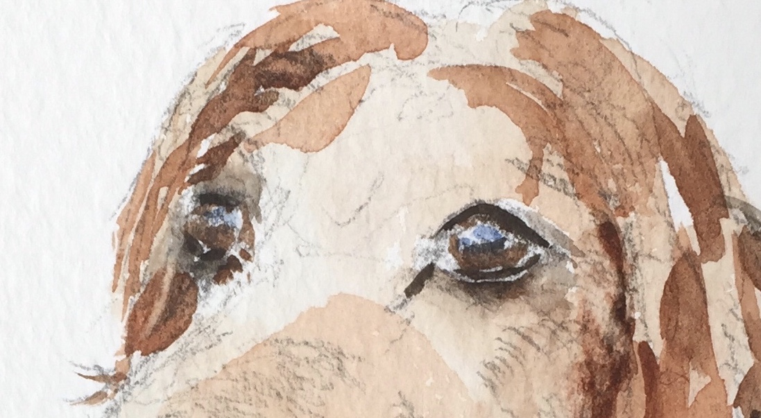
The concertina sketchbooks have good quality paper the take watercolour well.

When you have completed one side,

you simple turn it around and go the other way.

Now, there's an interesting thing.  When you turn the book and go back filling a new side, you aren't painting on the Back of the previous drawings....the pages in the sketchbook are Double sided, which helps prevent any marker pens bleeding through your previous drawing (marker pens tend to do that sometimes, so be aware).


Here's the book opened out


A useful tip, when you start using your book

1.   Mark it on the front with a small symbol

otherwise, each time you go to use it, you will be turning it around and around trying to find the start of it.  By adding a mark, you never have to waste time again and it makes life so much easier.  I'm all about that aren't you?

(I just put a squiggly line on this one)


2. I've added a short video showing when one side of the sketchbook is filled
and then start on the other side.


 ~ Hope you found this a help ~

Tuesday 26 June 2018

Using a Khadi Paper sketchbook

The thing with sketchbooks, is you need good paper.  It really does make all the difference to a decent sketch.  So you can image how challenging a Khadi-paper  sketchbook can be.  Not only is the paper roughly textured, but it swallows up watercolour like there is no tomorrow!


However, there is always a Solution 

and for this sketchbook I prepared some pages with gesso.

This will enable me to use acrylics for sketching ideas.


Prep with grey gesso and below
white/burnt sienna mix

As the gesso dries permanent, this makes it an ideal surface for acrylic paints -
of course, you could also prepare the pages with White gesso, I just chose not to.


Not all pages are gessoed though.
I have also painted directly on the white pages with acrylics -
 rough 'blocking in' idea for a future painting.

They remind me where I want to go with a large canvas.


This sketchbook is proving to be worth its weight in gold.


🎨🎨🎨


Wednesday 20 June 2018

Starting a sketch

Sketching a subject that may seem complicated,
can actually be split down into simple lines.

As with this painting of William in the sea.

Here's my initial outline, I kept it Simple


then outlined William with ink pen

and then added watercolour


As you see, it is a simple sketch.

With the sea, I put on one layer of watercolour and waited for that to dry,
then added a slightly darker tone - again waited for that to dry 
and finally a few dabs of much darker blue.


~~~~~~~~


Wednesday 9 May 2018

Stop and sketch

I had a little time to spare in town the other day, so decided to stop for  coffee.  That gave me a chance to OBSERVE people...and get some quick sketches done.  Certainly focuses the hand eye co-ordination when people constantly move AND move quickly.  You just have to go for it.  If you don't achieve the sketch, then be happy with what you have on paper, but try to REMEMBER  the person, then very often you can complete the sketch.

My sketch below was just the initial outline, enough information on shape and angle.  As the two people I had decided to capture, were still at their table, it gave me time to put in more detail.

However, if they had moved away, my initial sketch was enough for me to go from that and get at least something reasonable.


So with the extra detail - then watercolour added when I got home - here's my completed drawing 


Where I originally put the first figures, is where they remained, I built up the rest of the sketch from them.


🎨 🎨 🎨


Saturday 28 April 2018

Blocking in Shapes

Wow!!!   I took a break from adding Tips and Techniques  - Hadn't realised it was so long...

~~~

It can get rather confusing when you are faced with drawing something busy ~
like this scene


Don't get caught up in DETAIL,

to begin with ONLY LOOK FOR THE BIG SHAPES


When you have the Block shapes in place,
you can THEN go in with the Detail.


Friday 29 December 2017

It's a strange but true fact.......

..... the MORE you try to get something RIGHT in a painting

the MORE IT LOOKS  WRONG


WHEREAS


if you paint something WRONG

the more it looks

RIGHT


~ go figure ~


Monday 16 October 2017

Skin tone

Here's a question somebody asked recently about skin tone

Question: "What colours do you use in watercolour for skin tones?"

For me, it is always BURNT SIENNA

(Winsor & Newton in my opinion have the best tone of this colour and 
I use it regularly.


In the above example I have tried to show the varying tones that can be achieved with clear water added.


(please note that some artists find other manufacturers just as good,
but in my humble honest opinion the W & N one wins hands down)

🎨🎨🎨


Thursday 3 August 2017

Another technique for painting trees


Everyone has their own method for painting trees,
but getting started for some can be difficult.

Here's one of my techniques,
which in fact is used a great deal by watercolour artists, in the past Wesson and Seago used this style
and current days,  J. Bowden and John Hoar.


The technique is to add JUST SUFFICIENT PAINT to you brush, so as not to swamp it.
If you feel there is TOO MUCH pigment on the brush, then just wipe it
gently over a piece of tissue paper...WITHOUT REMOVING too much.
This all comes down to practise and getting
that 'Feel' for your paint brush.

Then

 paint with the SIDE OF THE BRUSH, not the tip.

You are after a DRY BRUSH EFFECT without it being too dry.


Here's a quick demo showing you,
but in the end it all comes down to

GIVING IT A GO YOURSELVES

AND YOU WILL SEE IT WORKS.


Thursday 22 June 2017

The packaging & Demo using Derwent Inktense Blocks

I've already mentioned Inktense blocks, and in this blog post I thought I would add a video using some.

In fact I have now got a set of 72, so lots of colours to play with.  Before I get to the video, let me show you the packaging of these blocks...


They are packaged in plastic trays,  one layer above the other...


 A good way to keep them, but lifting the top set of colours can be a little difficult.

They come with a cardboard separator, I have glued the cardboard to the bottom of the top set, 
that keeps the plastic tray firm -


Then I glued a piece of ribbon to the cardboard
which then makes a helpful handle to lift them out with.


Here's my quick demo using some of these colours.


When the ink dried, I then added some extra details...


Fun and easy to use.


Thursday 18 May 2017

Warm and Cool tones in paintings

The balance of a painting....

This is part of a blog post I added a couple of years ago to my main blog (www.studiohyde.blogspot.co.uk), but I thought it would be helpful here too.

Warm and Cool tones in paintings. 


My example is this sketch of Barnstaple bridge.

Pen + watercolour 
plus I added a small amount of detail with
my Sailor Calligraphy pen


Note:   The majority of this painting is in cool tones:

So to balance that out I added the warm red stripe on the boat.

Equally, if a painting is mainly warm tones,
then offset it with some COOL colours

It all helps the BALANCE of a painting.


 ~


Saturday 15 April 2017

Making waves the simple way

First some watercolour...


Let this dry.  Then add a slightly Darker tone of the same colour, basically less water more pigment...

If you want more obvious Waves, then just emphasise the shape, 
as seen in the bottom part of the next example.

When completely dry 
add White GOUCHE -
I used a flat brush for this


There you go
Simple Waves

🎨🎨🎨


Tuesday 4 April 2017

Derwent Inktense Blocks

Quick intro to Derwent Inktense Blocks

...I've had these for some time but only just got around to doing a colour swatch! 

These are INK in a block but can be used like watercolours - the best of both worlds if you ask me.

 (Inktense - Ink - intense colour = Inktense).


I've obviously got the tin with 12 colours, but do come in bigger packs with more colour choice.


The only thing I would say, they don't appear to have the colours named.
I have found a number on them though, so perhaps that's how Derwent deal with it.


I intend to do a demo using them soon.


Monday 13 February 2017

French Ultramarine Blue .v. Ultramarine Blue


Ever noticed that some paint manufacturers have

FRENCH Ultramarine Blue and also Ultramarine Blue

ever wondered what the difference is.


Well it's simple.  

FRENCH Ultramarine Blue is a purer, higher quality pigment paint

whereas, 

Ultramarine Blue 

it is more student grade (just as good but if you want to sell your artwork
then you should be using the better quality paints)


Friday 10 February 2017

Mixing New Colours from those you already have

So you have a few colours in your collection, most of us have.  Some colours may be missing like SEPIA or VANDYKE BROWN, even BURNT UMBER.

Well, if you have Raw Umber, Ultramarine Blue and Burnt Sienna....these will give you those missing colours.

Here's how...

RAW UMBER + ULTRAMARINE BLUE  =  SEPIA


SEPIA + BURNT SIENNA = VANDYKE BROWN


RAW UMBER + BURNT SIENNA = BURNT UMBER


Go on, give this a try and see the outcome, 
so easy to add to your collection of paints this way.

Wednesday 18 January 2017

When watercolour and sketchbooks don't mix

Graphite sketch - "William"


This sketchbook doesn't like watercolour.
Quite simply the watercolour seems to
disappear on the pages

Solution: use graphite or pen.


You see, when something doesn't pan out,
you just alter the way you use it.


Tuesday 10 January 2017

When your graphite has become a stub

You know how it is, you keep sharpening your pencils and they end up as a little itty bitty stub - what do you usually do - Yes, you give up and throw them away.  Well, hang on and check this out.

SAVE those plastic covers that come with brand new brushes...most people chuck them,

Don't, 
as
you
 need to save them,
they are useful...


(some of you will have seen this clip already on
Facebook)


 ~HOPE THIS IS OF HELP AND USEFUL FOR YOU~


Thursday 10 November 2016

Brand new brushes

Just a quick tip here :

When you buy a brand new brush (and oh isn't that great) remember to put it in some clear water for 2 or 3 minutes first...let it sit and soak up the water.   Brand new brushes have a coating on them, it holds them together before use, so you need to release that first.

You will see when the brush has relaxed and soaked up some water, you will then be able to use it with your paints.

~~~~~~~~~~~~~~


Sunday 18 September 2016

It's all a matter of Observation

Easily said - easily forgotten

That certainly goes for painting.
As Artists we tend to observe the world slightly differently from others,
but we don't always remember to Look

Looking AROUND US at the every day 
what do we actually miss!

....example was our sun brolly in the garden....

"Was it really LOOKING at ME"!

 Easily missed, but made me THINK.